Editor : Photoshop Cs5 and Photoshop Cs6
How to make Magical Book Scene :
Step 1
Start by creating a new document (1000X1500px).
Paste in your background landscape image, positioning it until it looks like the image below:

Now we want to blur our background, as this will later act to create a depth of field effect.
To do this, go to filters>blur>gaussian blur. Apply a gaussian blur (5.0px strength).

Now we want to blur our background, as this will later act to create a depth of field effect.
To do this, go to filters>blur>gaussian blur. Apply a gaussian blur (5.0px strength).
Now apply a couple of adjustment layers. Get into the habit of applying a clipping mask to your adjustment layers, so that they effect only the layer directly beneath them.
In this case we need to apply a color balance and levels adjustment layer. (settings below):
Color Balance Adjustment Layer Settings:
Highlights: -15 / -4 / -15
Midtones: +6 / -4 / -30
Shadows: +8 / +13 / +1
Levels Adjustment Layer Settings:
23 / 0.94 / 243


Step 2
Now paste in the photo of the girl reading from the resources to this tutorial.Cut it out using your preferred extraction method (I used the lasso tool).

Now apply a color balance, hue/saturation and levels adjustment layer (settings below). Be sure to apply a clipping mask to each adjustment layer.
Color Balance Adjustment Layer Settings:
Highlights: -11 / -2 / -6
Midtones: +4 / +12 / -26
Shadows: -5 / +1 / -13
Hue/Saturation Adjustment Layer Settings:
Hue: 0
Saturation: +15
Lightness: 0
Levels Adjustment Layer Settings:
51 / 1.00 / 244


Step 3
Now paste in the stones photo from the resources for this tutorial.Position it beneath your girl so that she appears to be sitting on it.
Now duplicate your stone layer, hiding the duplicate.

Now apply a color balance and levels adjustment layer, each with a clipping mask.
Color Balance Adjustment Layer Settings:
Highlights: -4 / -1 / -26
Midtones: +6 / +9 / -28
Shadows: +4 / +5 / -4
Levels Adjustment Layer Settings:
29 / 0.90 / 215


Step 4
Now make your duplicate stone layer visible again. This layer is sharper, as you haven’t applied a gaussian blur. Now duplicate your adjustment layers and apply these to your duplicate stone layer.Now apply a layer mask, and use a soft black paintbrush to mask off the bottom of your duplicate stone layer. This will mean that your stones will fade from sharp at the top, to blurred at the bottom, as you expose your original blurred stone layer.

Step 5
Now apply a new layer called ‘book main light’.Drag out a radial gradient from the center of your book. Then reduce this layer’s opacity to 30% and apply a layer mask. Then use a soft black paintbrush to mask off the light which overlaps your book. This should give the impression that light is coming from the pages of your book, rather than overlapping your entire book.


Step 6
Now paste in your hot air balloon image from the resources for this tutorial.Rotate/resize it to fit in with your image like below:

Now apply a hue/saturation and color balance adjustment layer to your hot air balloon layer:
Hue/Saturation Adjustment Layer Settings:
Hue: 0
Saturation: -35
Lightness: 0
Color Balance Adjustment Layer Settings:
Highlights: +9 / +9 / -29
Midtones: -9 / +15 / -40
Shadows: +25 / +19 / +15


Step 7
Now repeat step 6, but apply several more hot air balloons, color correcting each one:
Step 8
Now open up your cloud photo from the resources to this tutorial. Crop it to look like the image below:
Now duplicate your cloud image layer. Now in the levels up the contrast of your clouds and go to select>color range. Use ‘sampled colors’ and click on the blue sky. Then hit ok.
Your selection should have most of your sky selected. Now go to select>inverse. This will invert your selection so that your clouds are selected.
Now return to your original cloud layer (the one which you haven’t upped the contrast on). Copy/paste your cloud selection back into your original document:


Now apply a layer mask, and use a medium, soft black paintbrush to mask off the edges of your cloud image:

Now resize and warp your clouds to fit into your book. If necessary apply some more masking to fit them neatly inside the book’s pages.

Now apply a hue/saturation and levels adjustment layer.
Hue/Saturation Adjustment Layer Settings:
Hue: 0
Saturation: -100
Lightness: +29
Levels Adjustment Layer Settings:
32 / 1.25 / 213


Step 9
Now paste in your ‘firework 1′ image.
You’ll notice that it has a black background. To hide this, change your layer’s blend mode to ‘screen’. Use a layer mask to hide any extra edges or unnecessary details.

Apply a second firework image just to add more light:

Step 10
Now cut out and paste in the image of a lizards tail:
Now resize and warp your lizard tail to appear like it’s coming out from the pages of your book:

Step 11
Now use a similar technique to paste in your lizard claw, making it appear to be clawing it’s way out of the book. Adjust the hue and levels so that the image fits in correctly with your composition:
Step 12
Now open up your jet stream photo. Use your color range technique to extract the smoke, and then copy and paste it back into your original document:
Apply a layer mask to mask off the right area of your jetstream:

Now apply a hue/saturation and levels adjustment layer to your jetstream layer:
Hue/Saturation Adjustment Layer Settings:
Hue: 0
Saturation: -100
Lightness: 0
Levels Adjustment Layer Settings:
39 / 0.69 / 151


Now select your jetstream layer and adjustment layers and hit option+g to put them in a group folder. Name this folder ‘jetstream’. Now duplicate the folder, and move the duplicate jetstream up a little way above the original. Reduce this folder’s opacity to 35%. This should create a nice twin jetstream.

Step 13
Now paste in your plane image from the resources section for this tutorial. Scale and position the plane to fit so that the jetstreams appear to be trailing from it:
Now apply a color balance and levels adjustment layer:
Color Balance Adjustment Layer Settings:
Highlights: +22 / +19 / -18
Midtones: +26 / +19 / -15
Shadows: -13 / +9 / +6
Levels Adjustment Layer Settings:
22 / 1.00 / 229


Step 14
Now it’s time to start working on the lighting of our piece.You’ll notice that currently the girl isn’t casting any shadows on the stones she rests on. To fix this create a new layer called ‘shadows girl sitting’. Use a soft black paintbrush at a relatively low opacity to build up shadows underneath your girls legs.
Be sure to have this layer above your girl/stones layers, but below your jetstream and plane layers.

Step 15
Now we want to add some lighting to the piece.Create a new layer called ‘yellow lighting’.
Drag out several radial gradients ranging from fae305 to transparent.

Now change this layer’s blend mode to ‘overlay’ and reduce it’s opacity to 30%

Now repeat this technique but with a series of blue to transparent radial gradients and orange to transparent radial gradients.


Step 16
Now create a new layer called ‘dodge/burn’. We want to dodge/burn our image in a non-destructive way. To do this, go to edit>fill>50% gray.Then change your layer’s blend mode to ‘overlay’. This will allow you to paint black and white onto this layer in order to dodge/burn your image.
The images below show your dodge/burn layer at ‘normal’ blend mode and then ‘overlay’ blend mode. I also reduced my dodge/burn layer’s opacity to 70% to make the effect less intense.


Step 17
Now create a new layer called ‘vignette’. Use a very large, soft black paintbrush at a low opacity to paint over the corners of your image. This should help frame your girl, and draw the viewers eye into the center of your composition:
And We’re Done!
You can view the final outcome below. I hope that you enjoyed this tutorial and would love to hear your feedback on the techniques and outcome.Published : Janet Cecilia
Editor : Photoshop
Make an Inspiring Artistic Poster with Drawn Elements
Step 1
Let’s get started reviewing how to create this “Draw” poster. Then first thing that we’ll do is plan the size, contents, and colors. I made mine for an A3 size poster, which is 420 mm by 297 mm, or 4961px x 3508 px, set at 300 ppi. The advantage of creating it in a large size is the ability to later adapt it to a printable full-size posters, magazine illustrations, design clothing like t-shirts, or web design content. Whatever size you choose, keep in mind that I will be giving instructions based on an A3 canvas at 300 ppi.
The content will revolve around the theme of drawing, using various techniques: water coloring, doodling, and ink pen illustration. We’ll draw the doodles using a regular marker and paper, and don’t worry if your drawing skills are out of practice, I’ll explain the process. The ink pen look is achieved mostly through the ink-like purple color and paint splatters.
As a color scheme, I started by choosing a neutral background color: e4c99f. Next up is the darker purple color that can add depth and contrast to the design: 2d3043. The second main color emerged from the background: e49549. So why two shades of orange and purple? Well you generally need a dark color that acts as a chromatic anchor. I chose purple simply because it resembles ink. There are plenty of colors you can choose with purple, like lime-green or yellow, but I wanted something that would add warmth.
Well, enough chatter, let’s get our hands dirty! Create your canvas at an A3 size set to 300 dpi. Fill the background color with this color: e4c99f. I created a simple layout with dark lines.

Step 2
The first element that we’ll create is a sketchbook. It will be barely noticeable and only suggestive. To create it, you’ll need the two inner covers from this Bittbox freebie. Use number 3 and 10 in the download list. After you put in Photoshop, go to Filter > Extract, and paint it accordingly in order to cut it out. Use a large enough brush size that will preserve the threads.

Step 3
After extracting it, press Command + T to transform it and skew into its new position.

Step 4
Double click on its layer to add a layer style. Add a Color Overlay and select a shade of purple.

Step 5
Duplicate the layer (Command + J) and move it slightly in order to give the cover thickness. Change its color to the background color.

Step 6
Repeat the same process with the second photo, except change the outer cover’s color to our orange.

Step 7
It’s time for some doodling 101. Below is an image of how I created the trees. My personal tip is to start off by making small steps. Create simplistic shapes and observe what features you like or dislike. From the very start, I decided that my trees should be overly simple on the bottom, complex on top, and that they would simply be an illustration, not a representation. It’s a more a caricature of a tree, than an actual sketch.
So go ahead and grab a pen and piece of paper. I used an Ultra Fine Point Sharpie Marker, which works great on standard Xerox paper. I didn’t use rough paper, because I wanted the line edges to be soft. You might want to try doing that as well. Once you created your trees, scan them and insert them in a separate Photoshop project.
Note: When drawing, keep in mind the fact the elements need to be proportionally balanced in size.

Step 8
Put the new tree on the top layer in your file and create a white background one a layer underneath. Once you have the scanned tree in a layer, duplicate it (Command + J) and set the layer’s blending mode to multiply. That will darken it.

Step 9
Go to Select > Color Range, and in the drop down menu select Shadows. This will select only the black from the image.

Step 10
After making the selection, right click inside the canvas, while having the marquee tool active, then select Make Work Path. Input 1,5 pixels in the following menu. Fewer pixels will get you a more harsh result, and more will smooth and straighten the lines. Try to find a balance, as too many pixels will make the art too geometric.

Step 11
Go to Layer > New fill layer > Solid Color, and fill the selection with our purple.

Quick Tip
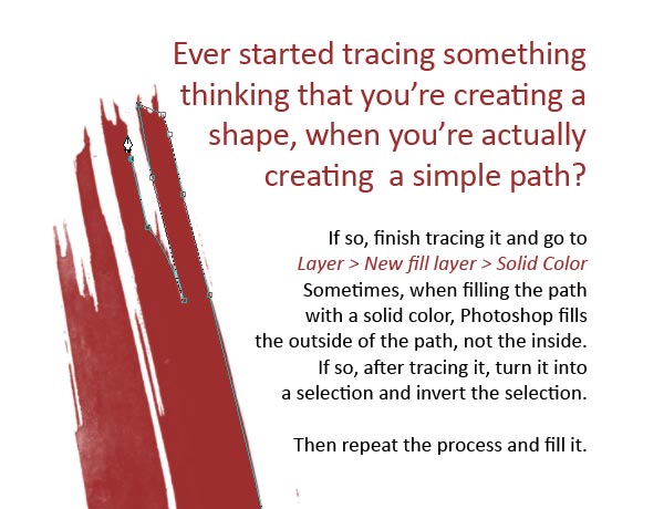
I’ve often started tracing something with the pen tool thinking that I was creating a shape, though I was actually in path mode. In case this happens to you, there is a way to get out of it. Finish tracing it and go to Layer > New fill layer > Solid color. Select a color and you have a vector shape. However, sometimes when you try to fill it, Photoshop will fill the outside and not the inside.
To correct this, after tracing it in path mode, right-click in the canvas while having the marquee tool selected and go to "Make Selection" You’ll notice that the selection is inverted. So just press Command + Shift + I to invert the selection. After that, turn it back into a path and fill it.
Step 12
Let’s get back to our tree. We need to create its background. All we have now is the outline. So get the "Pen Tool" and start making a background for it. Because of the style, I wouldn’t be too careful on tracing it exactly. Fill it with the pale orange background color in your project. That’s it.

Step 13
Now that you know the technique, you can make another tree (or more) and some clouds. Play around with the layout, but try not to overlay elements that weren’t drawn together (touching each other in the actual doodle). And avoid clutter. Keep the design spaced out with enough white space to give it room to breathe.
Note: Keep the width of the elements similar. Enlarge or shrink elements proportionally and all together, otherwise you’ll get different types of line thickness. You want them all to have the same line thickness.

Step 14
At this point, we’ll add the text. Download this font: Refuse. Type in the letter "D" in your project. Make sure it’s on the top layer (above everything). Under this layer, create a new layer and fill the entire canvas with white.

Step 15
Position the newly typed letters in your design. Simulate depth by enlarging several letters. Avoid symmetrical pairing by grouping letters in 2-2 or 3-3 format. I put mine in 2-1-1, which gives a more dynamic feel. Slight slants are welcome, but don’t exaggerate – remember the fact that this is a somewhat stationary scene, so the letters need to look like they are floating. To see an arrangement of letters that simulates rapid movement, see the fourth version in my Behance "Draw" series, entitled "Color".

Step 16
Go to the "D" Letter and Command + Click on its layer icon to select it with the Marquee tool. After doing so, go to Select > Modify > Contract. Now this is the tricky part. We have to get the thickness of the outline to match the thickness of the tree and cloud lines. Contract the selection thinking that the marquee you are seeing will be the actual thickness of the outline. I contracted mine by 10 pixels, because that was how I got it to match the tree.

Step 17
Right-click in the canvas, while having the Marquee tool selected, then press Make work path and use 1,5 pixels.

Step 18
So far, we’ve vectorized it in the same technique as the tree with a minor adjustment on the thickness. It’s time to do something a little different again. Use the Direct Selection tool (A) to delete parts of the newly created path that resemble holes. You may choose to leave some in if you like, as i did, but Delete the small holes.

Step 19
As soon as you clean up the path, go to Layer > New fill layer > Solid color.

Step 20
Grab the Pen tool and trace the background of the letter. Also, change the outline’s color to the pale orange and newly traced background shape to purple. This gives a more unique effect, being inverted. Once again, be intentionally inaccurate, but don’t exaggerate.

Step 21
Repeat the same process with every letter, constantly adjusting how much you are contracting the marquee selection to the current thickness of the trees and clouds.

Step 22
Now it’s time to have some fun with bittbox’ freebie brushes. Download these brush sets: Watercolor,Watercolor II and Grungy Watercolor. Start by adding the background watercolor. Use our purple color and keep track of your layout! (Remember Step 1).
published : Janet Cecilia
Editor : Photoshop
Create a Stylish Two-Tone Photo Montage
Step 1
Open up the first texture from this great texture set courtesy of BittBox: Light Grunge Textures.
Resize your image to be 1000X750, and you have your background.

Step 2
Now download the photo of a large statue head. Paste it into your main document. Then cutout this image using the pen tool or lasso tool.
We want the statue head to be facing upright, and to be central in our canvas. To do this, copy/paste your selection to paste the head onto a new layer. Delete the original photo. Then go to edit>transform>rotate and rotate the head until it looks right. Finally, I want to make my photo a little smaller, so I drag in the corner of my scaling box whilst holding shift+alt (to keep the same image proportions and also keep my image perfectly central in my canvas).


Step 3
Now we want to get rid of the head support on the left side of the statue’s face. To do this select the clone stamp tool, and make your brush around 30-50px in size. Begin cloning areas of the statue’s face around the support and pasting them over the support area. To do this, alt+click on the areas you want to copy, then release alt and click on the areas you want to hide. It doesn’t matter if this step isn’t absolutely perfect, but just try to roughly cover up the selected area.

Step 4
Go to image>adjustments>levels and apply the settings shown below. This should make your head a lot darker and more intense.

Step 5
Now paste in an image of an ink splatter. Position it over the dark cheek of your statue head.
To make the white background of this image hidden, change the layer’s blend mode to ‘multiply’.
Then resize it, and use a large soft eraser brush to merge it slightly better with the head.


Step 6
Add several more splatters to the dark side of your face. Once you’ve created all of your splatter layers and erased them to blend with your face, merge them all into a single ‘splatter’ layer.

Step 7
Now hide your ‘face’ layer, leaving just your background and splatter layers. Go to select>color range and apply the settings shown below. You can see that the white area in the selection window shows the area that will be selected (my splatters). This is because I’ve selected ‘shadows’ from the selection menu.
Now with your selection in place, create a new top layer called ‘selection shape’. Fill in your selection on this layer using a bright, obvious color (I went with red).


Step 8
Now, stay on your ‘selection shape’ layer and alt+click on your ‘face’ layer in your layers palette. This will select your entire face shape. Now fill in this selection with your same bright color. This should give your a brightly colored shape on your ‘selection shape’ layer that is the same shape as your face+splatter layers data.

Step 9
Now paste in a photo of a garbage bag onto a new top layer. Resize and move it to fit over and cover your selection shape layer shape. Then, alt click on your ‘selection shape’ layer in your layers palette to select your colorful shape. Go to select>inverse and then select your garbage bag layer and hit ‘delete’.
You can see the result of this below:


Step 10
Now go to image>adjustments>desaturate to grayscale your garbage bag.
Then go to layer>apply layer mask>reveal all and select a large, very soft, black paintbrush and begin painting over the parts of your garbage bag covering the light side of your statue’s face. Be sure to use a low opacity paintbrush, as your black paintbrush strokes will be erasing parts of your garbage bag. We’re using a layer mask as this preserves your original garbage bag photo if you make a mistake.
I also made sure to brush over my face’s features (the eyes, nose and mouth) as I wanted these to show through more. The result of this step is that you’ve given parts of your face a super cool texture!

Step 11
Now go to image>adjustments>levels and apply the settings shown below in order to enhance your garbage bag texture.

Step 12
Now paste in an image of some smoke onto a new top layer called ‘smoke 1′. We want to turn this photo into some stylish black smoke going over parts of our main image. To do this, first go to image>adjustments>grayscale to desaturate it. Then go to image>adjustments>invert to create a negative image of the original (black smoke on a white background).
Then to make the smoke stand out more go to image>adjustments>brightness/contrast and increase the contrast to +60.


Step 13
Now change this layer’s blend mode to ‘multiply’ and select various parts of your smoke, moving them to fit over parts of your face. Then use a large, soft eraser brush to erase away parts of the smoke to make it blend better. I ended up duplicating this layer and merging the duplicate down with the original in order to make the smoke more prominent.

Step 14
Now use your rectangular marquee tool to select a thin strip at the top of the statue’s face. Click on the mask on your garbage bag layer and fill your selection with black to hide this part of your layer. Add a layer mask (reveal all) to your face layer and repeat this same process.
Then create some similar rectangular shapes over nearby parts of your image. This should give the impression of a broken look.

Step 15
Now create a new top layer called ‘pen lines’. Draw out a curved path line using your pen tool, that curves under the statue’s left eye out into your main background. With a 1px black paintbrush selected, right click on your path line and click ‘stroke path’. This should give you a 1px curved black line. Then duplicate this layer and move the duplicate 5px beneath the original. Repeat this several times, and then merge all of your path line layers together. Then use a large, soft eraser to erase the left and right sides on your collection of path lines. Finally, reduce this layer’s opacity to 50%.

Step 16
Paste in a photo of a rock. Cut it out using your pen tool or lasso tool. Then go to image>adjustments>desaturate. Then duplicate your rock image multiple times, each time resizing and rotating the image to make your composition more random. Try to make the light side of each rock face the right side of your canvas, as this fits with the lighting of your statue’s face.

Step 17
Now go to filter>blur>gaussian blur and apply varying amounts of blur to each rock. You want to blur the closer rocks much more, and apply a subtle blur to the furthest away. Ultimately you’re looking to give the impression of perspective in your cluster of rocks.

And We’re Done!
I hope that you enjoyed this tutorial, and as always I’d really appreciate your comments.
You can view the full-sized outcome by clicking the image below:

Tidak ada komentar:
Posting Komentar